Statements by the Jury | July 7th, 2017 | Munic, Germany
Category HELP/CARE
Kawalki | Malwina Borowiec + Karolina Chodur, Pigalopus, PL-Warsaw
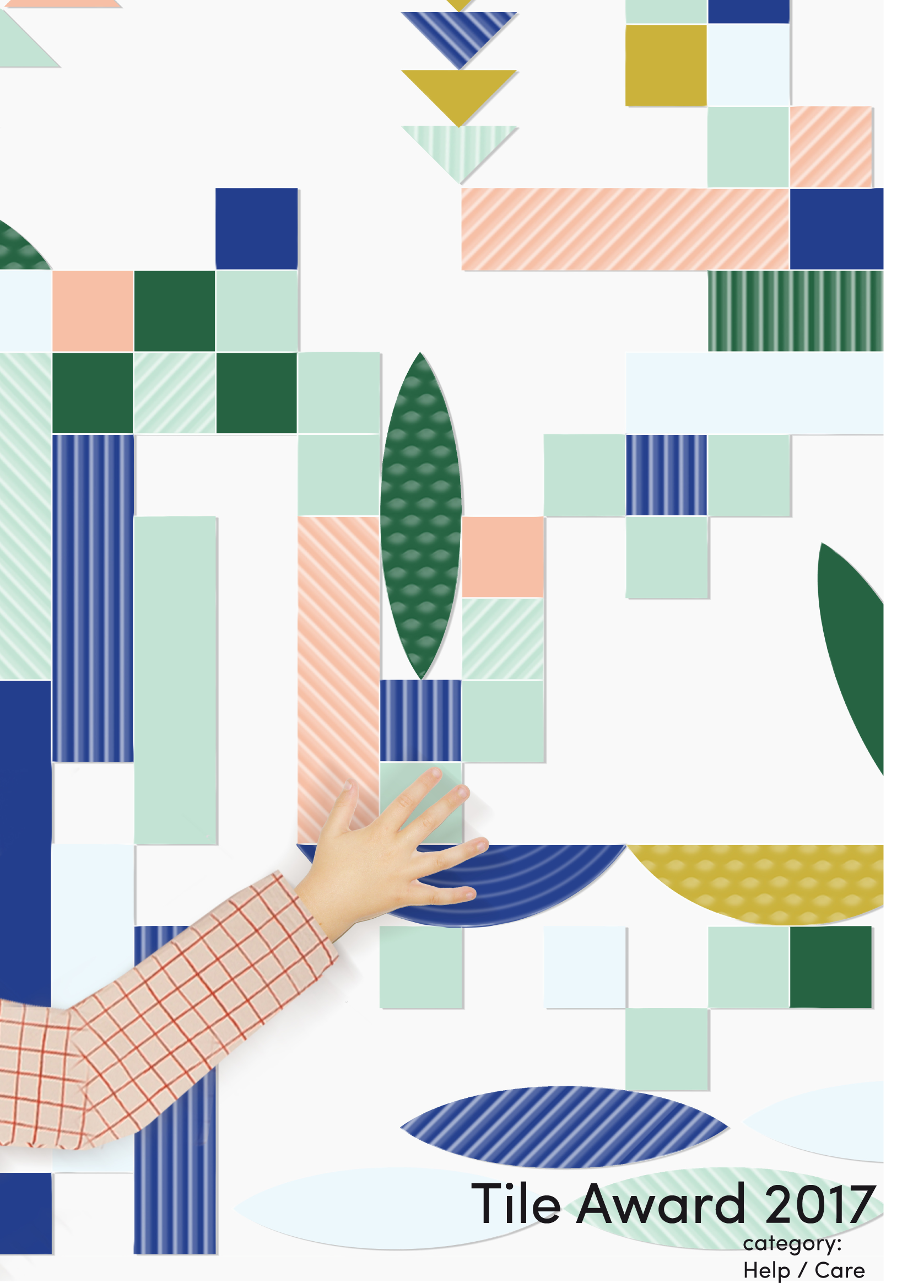
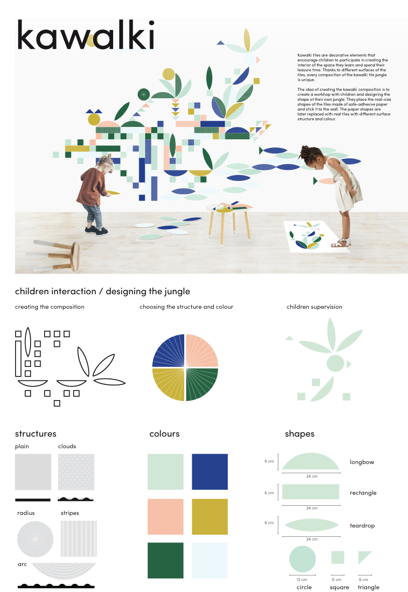
The proposal is based on a simple yet multi-faceted idea that addresses all senses. Like a Lego system, “Kawalki” stimulates interaction in a fun and playful way. The idea is clear, well presented and shows a wide potential for further development. Ceramic may not be the obvious choice of material for this concept, at the same time it makes the project more challenging and unexpected.
Recommendations for workshop:
The jury is hesitant to the idea of using stickers in the creative part of the process. Can the tiles be the only elements needed, both for sketching and in the final application? The possibility to move and remove the tiles would probably be a key to make this system truly interactive. Magnetism, reversible adhesive? What would be the most feasible technique? Explore the possibilities and limitations of ceramics. How can shape and size make the tiles durable and child-friendly, and how does the spatial experience change with the design of the tiles?
New Delft Blue | Agata Kycia, DE-Berlin
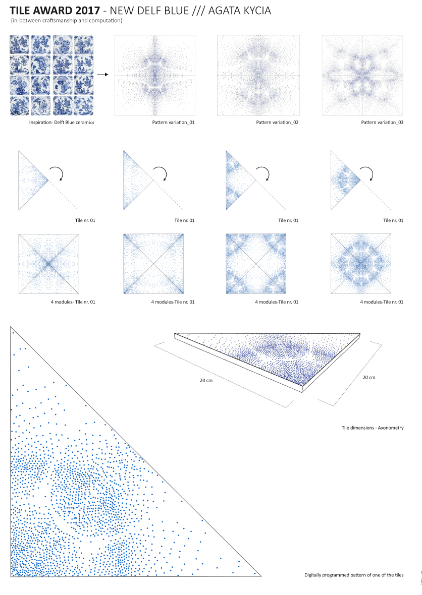
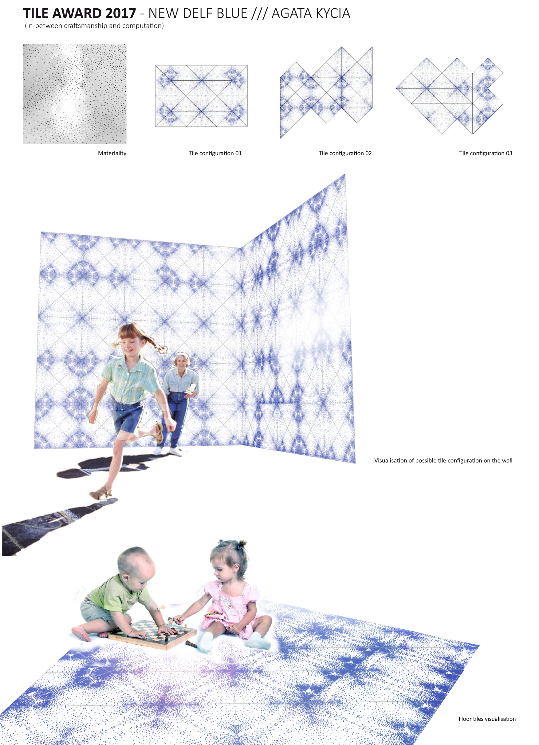
The motif is reminiscent of my grandparents’ kitchen, more precisely grandma’s kitchen, who in those days certainly was the ruler over this refuge. The project shows a beautiful approach of how this traditional motif can be refined in terms of design. The jury intensively discussed whether the motif suffices as a starting point. The possible way pointed out here shows clarity and is reduced to the essentials. It is, however, a very European motif, not an international one.
A possibility to expand the approach would be to additionally research other traditional motifs, find them and develop a modern translation.
As part of the workshop it has to be examined whether this kind of blue is crucial for the design. Obviously, printing this specific blue presents a certain challenge. Painting dots by hand is out of the question in case of industrial production. Thus the idea to reinterpret something very traditional in a modern way and then have it produced using conventional craft techniques would be a certain inconsistency of the design idea.
Other colours as well as additional motif approaches and the associated breadth of the concept would be desirable in the revision phase
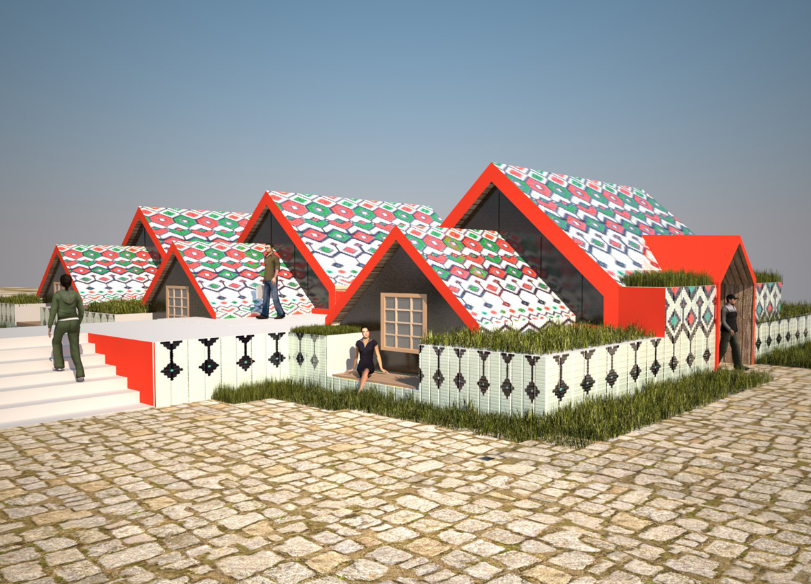
Stay Unique | Agnes Tröger-Morguet, Agnes Morguet Innenarchitektur & Design, DE-Cologne
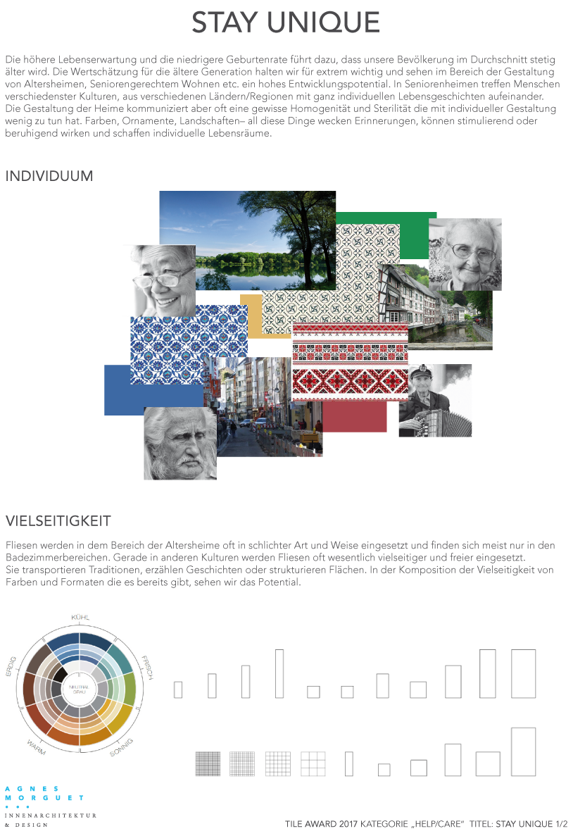
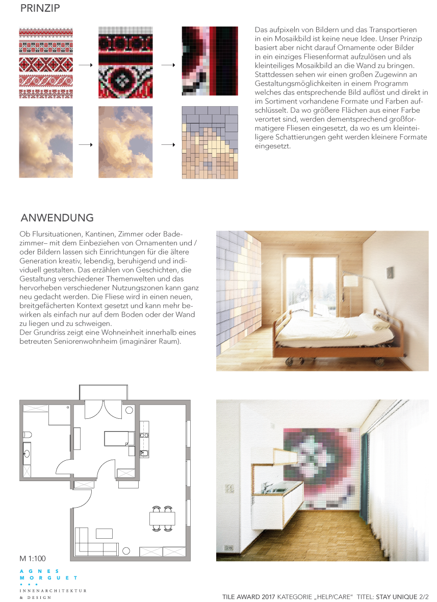
Relation to ceramic: Supposedly if you can make a large enough array of colour. One could create a catalogue of pixel colours that would work for any image subject. These I assume are imagined to be recomposed on the walls of each hospital room – creating a unique experience.
Recommendations: I like the project but I do think it needs to be a bit more clever. There is a surprising factor that is missing. This is where the project needs to be developed more. How is the tile attached to the wall? What kind of wall? What kind of tile? This needs to be designed much more. Is it only an intervention on the wall or on other surfaces? At the ceiling as the patient is unable to look out but maybe only up?
I like the perceptual question the project could ask. As so many artists have asked already. What is it that moment when a visual acknowledgement happens of a figurative reading changing to an abstract thing? Are we closer to richer emotional experience as we move into abstraction? Something becomes like something. Maybe this is also closer to a reading that could be enhancing to helping in the return to health of the patient? Maybe?
Kategorie SHOP/SHOW
Iceland shop house | Olga Solomatina, RU-Moskow
Relation to ceramic: That the ceramic outside skin can be used and designed as a floor, wall and roof surface. There also seems to be a lot of fun one could have in exploring weaving and ancient motifs, patterns – but using this new material. Can it become more 3 dimensional? Cultural icon meets ceramic innovation we hope?
Recommendations for workshop: It should be developed like an outside skin so that it can work on all surfaces from urban floor to wall to outside roof. I don’t know if the project has to be a cute house form. It seems that a shop could be more a cube for example or another form that is suggested by the weaving. It is not the subject to get caught in typologies. Can woven material also be opened up at times to let light etc pass. What are degrees of porosity?
Light Emitting Tile: L.E.T. | Prajapati Piyush, Godwin Austen Johnson, AE-Dubai
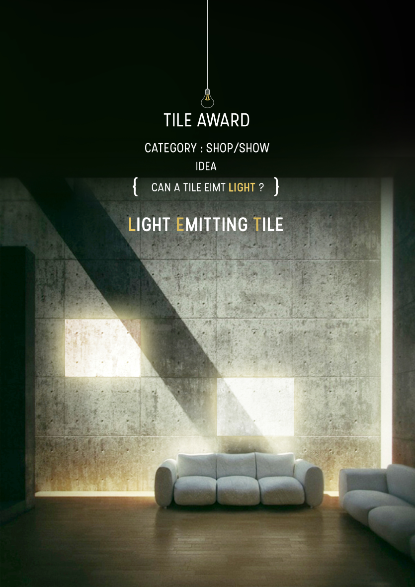
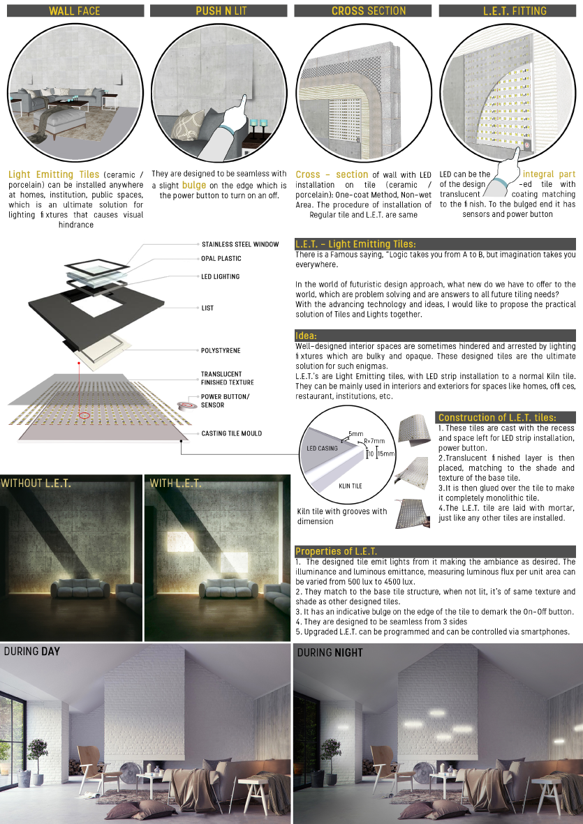
The jury is curious to see how a hard and robust material can suddenly seem soft and gentle and thus undergoes an exciting transformation. The jury emphasises that the further development of this project should less be about a technical product development but rather about the establishment of the material, atmospheric and spatial quality of LET.
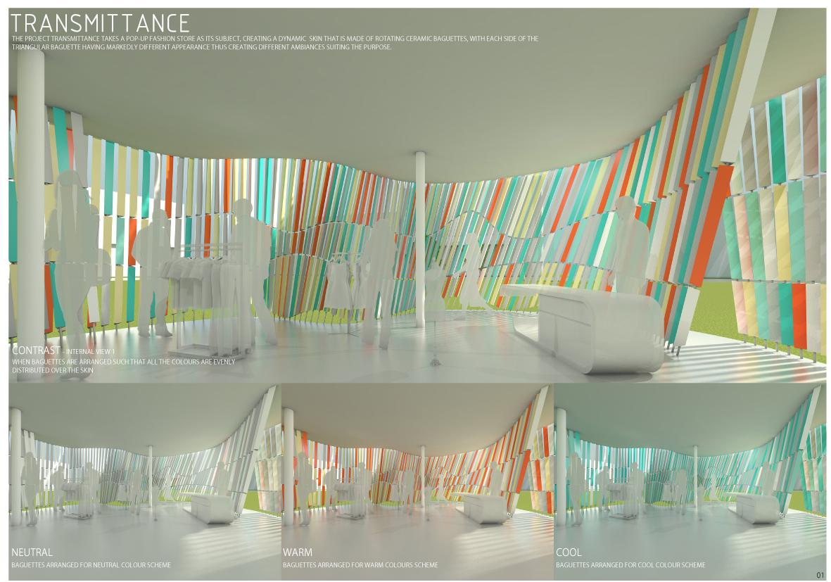
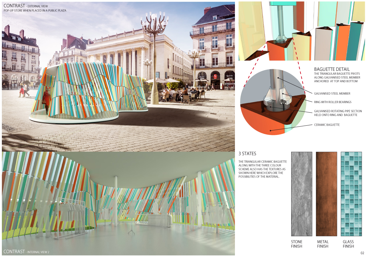
Transmittance | Avishkar Bharati, JDAP Design – Architecture – Planning, IN-Mumbai
Category MOBILE/TRANSIT
Systems | Joa Herrenknecht, Studio Joa Herrenknecht, DE-Berlin
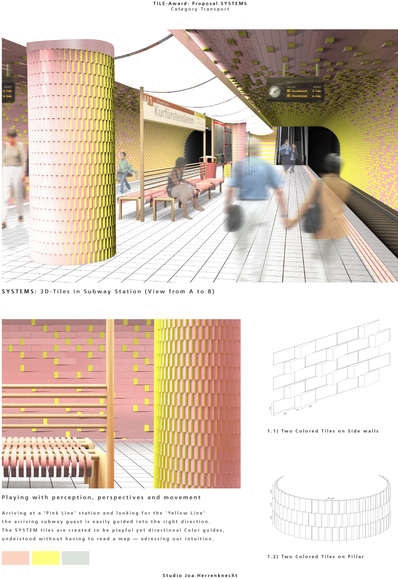

The proposal successfully combines a use of bi-coloured flat and relief tiles on different surfaces. Although the overall concept is not new, namely it can be traced back to optical effects, cinematic art and public art from the 1970ies on, the use of bi-coloured tiles is appropriate and logical for transit spaces.
The proposal has a big potential to explore the effects of movement and perception and its materialization in transit places. It should become an example of a contemporary linkage between a customized, specific and standard design.
It is recommended that the candidate develops a couple of single elements whose application would generate a different space, unseen before.
Travellers Wheel | Joao Araujo Sousa + Joana Correia Silva Arquitectura, PT-Porto
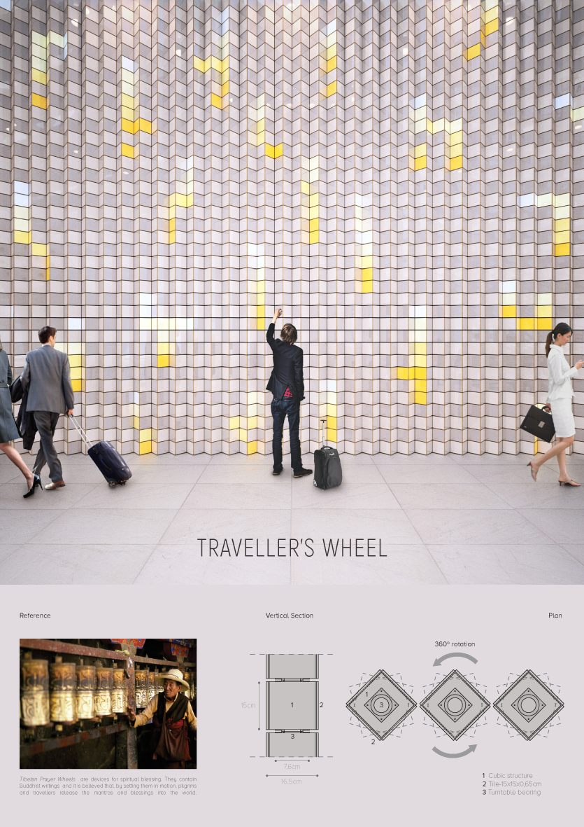
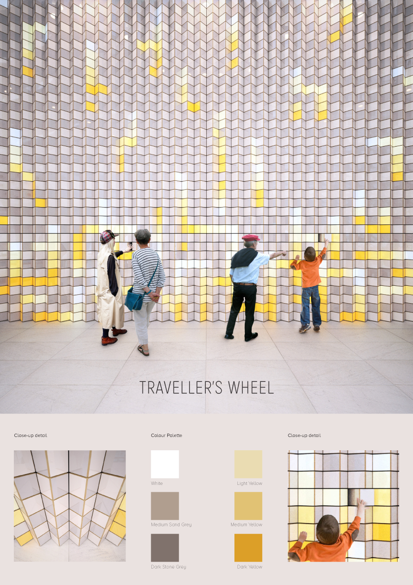
The proposal presents a simple but efficient use of ceramic tiles in public spaces.
It could be recommended to a candidate not to detour the starting idea during the workshop but explore and test different dimensions and positions of the proposal. Should this become a playground which will distract travellers’ attention from their smartphones while waiting?
RE:Tile | Andreas Crynen, Ingenhoven Architects, DE-Mönchengladbach
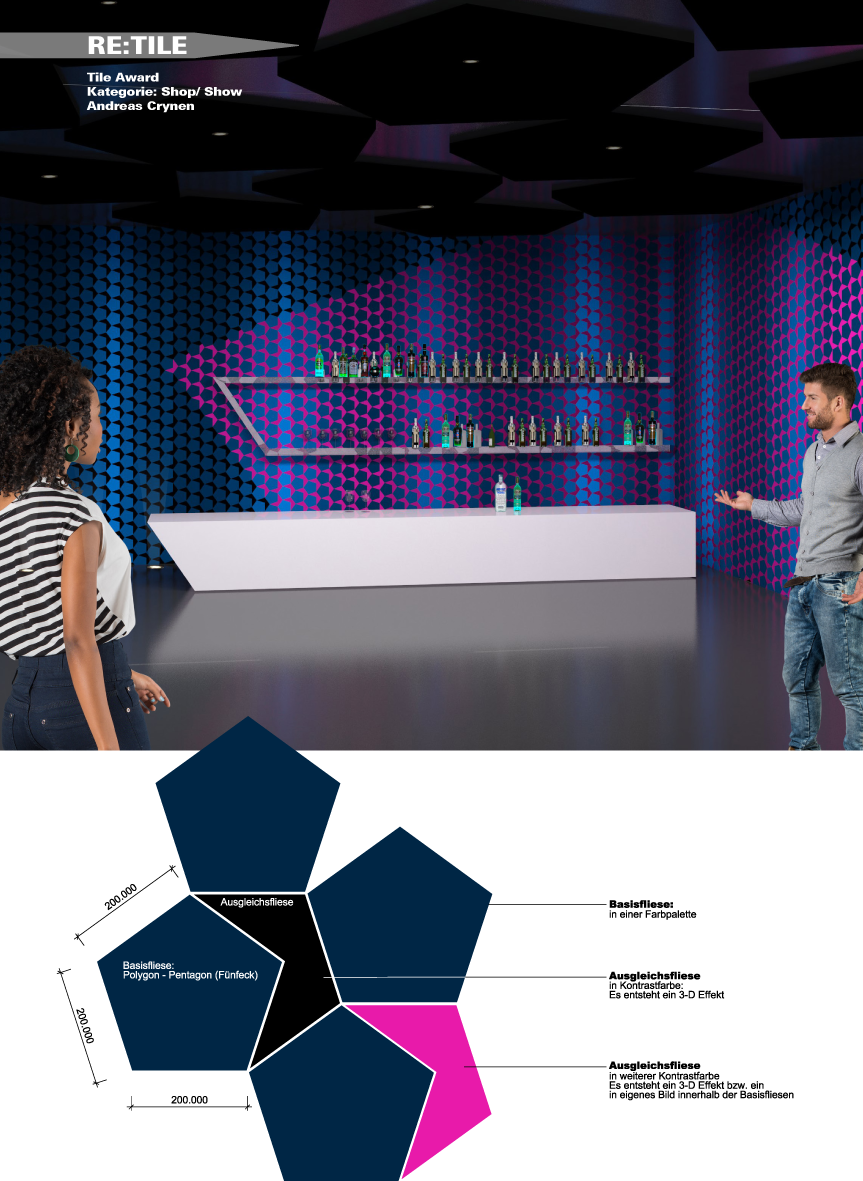
Easy to produce and providing varied forms of applications, RE:TILE certainly allows the design of exciting surfaces. Although the product is probably marketable, the jury would like to see more innovative energy the Tile Award wants to reward.
The aim of the workshop must be to analyse the application of RE:TILE more intensively; this can involve the verification of the versatile usage, the improvement of spatial effect and depth as well as the development of a stronger material image.